
New color harmony option
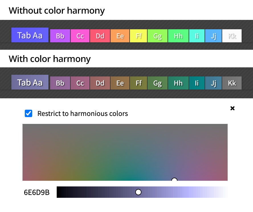
When you’re picking a color scheme (from the “Colors / Settings” button at the top of your Protopage), a new type of color picker is now available.
If the “Restrict to harmonious colors” option is not ticked, then you will be able to choose any possible color. This gives you the freedom to pick bright and vivid colors.
However, that freedom can come at the cost of text being unreadable on some hue variants of the color you have picked.
If you tick the “Restrict to harmonious colors” option, this will assist you in choosing colors where text is readable on all hue variants of that color.
This is particularly useful if you are making use of many different hues in order to color-code the tabs in your Protopage.

February 20th, 2021 at 2:29 pm
Thank you for this. One thing I have noticed on RSS feeds now is a faint dotted line under each news item. And in bookmarks there is a faint dotted line under each link. I’ve tried changing the background colour but it doesn’t change it always seems to be there.
Not a big problem, but just something I noticed.
February 20th, 2021 at 4:32 pm
Hi Steve, thanks for the feedback. We intentionally changed the look of RSS feeds a little.
Before, each headline had a bolder underline link. However, this often made headlines bleed into each other when headline “line wrap” happened.
We therefore switched out the much darker and bolder headline underlining with a lighter dotted “delimiter” between headlines. This is an automatically chosen color that is simply a lighter version of the color used for the text, and cannot be affected by changing the colors/settings background color.
Hopefully the change isn’t too much of a shock, and that you might come to adjust to it and even prefer it over the next few days :)
March 12th, 2021 at 6:18 pm
Thank you! That makes the page tabs even easier to read than before.
March 17th, 2021 at 5:19 am
The new color harmony idea sounds good, but I was unable to find a control for it on the Colors/Settings page of my personal Protopage.
I checked out the seperator lines for items on the widgets. They are there, and are a good idea, but I wish they were more visible, as they looked more like ghost lines, and I could barely see them. Even if I had good vision I wouldn’t be able to see them good. Unfortunately, I don’t have good vision, so it’s even worse for me. You should add a control on the Colors/Settings page to give people an option for how visible they want this divider line to be. Maybe check boxes for faint, moderate, dark, or very dark, or perhaps a slider control to increase or decrease the darkness or lightness of the line.
i’ve had a number of different home pages over the years, but I prefer my Protopage one the most. Amongst the others I’ve had were ones at Google, Yahoo, Hotmail, and MyWay, but I’ve had a few others that didn’t last long, so I don’t remember their names offhand. I even tried Facebook for a couple of weeks once, but didn’t like it, so I closed my account after that. For those who’ve heard of My Space, that’s not the same as MyWay.com. They are different sites. I think MyWay.com is still around, but I like Protopage better, so I don’t plan on starting another home page at MyWay.com again.
With Protopage I was able to pick a color set that is easy on my bad eyes. I like being able to have different column options on each page/tab of my home page. I also like being able to move widgets around, to add more widgets as needed, and to delete widgets when I no longer want them. I don’t use many different kinds of widgets, but I have tons of different website bookmark widgets, and lots of headline widgets, too. I also use a few of the in-house widgets, like the notepad one. Protopage gives me the flexibility I want, and the ability to adjust the colors for my bad eyes, and does it all better than the other home pages I’ve tried.
Thanks–Questor
March 17th, 2021 at 10:34 am
Thanks for the feedback, Questor, we’re always looking for ways to improve.
April 9th, 2021 at 2:39 pm
Love you guys – thanks for an awesome service! :)