News Feed Thumbnail Previews and Auto Arrange
We’re introducing two experimental features today – we have not enabled them by default for existing users but you can try them by following the instructions below:
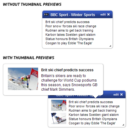
Our news indexing system has been upgraded to provide thumbnail previews for your news feeds, in order to give your page a more exciting look. See below for before and after screenshots:

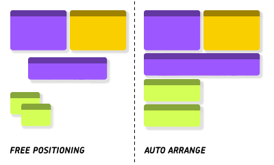
This new feature automatically aligns your widgets into columns, and automatically resizes the widths of the widgets to fit the width of your browser. This feature will be particularly useful for those of you that use your Protopage on multiple machines, each with different monitor sizes.

Instead of imposing a ‘one widget per column’ approach, the Auto Arrange feature will allow widgets to span two or more columns if required, giving you maximum flexibility with your page layout.
Auto Arrange can be switched on or off for each individual tab inside your Protopage – so that you can enjoy both layout systems according to the type of widgets on your page (pages with lots of RSS News Feeds tend work well in columns, and sticky notes tend to look best when freely positioned).
If you have just registered a new Protopage, these features are already enabled for you.
If you are an existing user and would like to try these new features, click the ‘Colors / Settings’ button on the toolbar at the bottom of your page, and un-tick the following two settings:


November 15th, 2007 at 7:42 am
Nicely done, guys!
It seems you guys aren’t very much into public beta-testing and things like that: you thoroughly test stuff yourselves and only introduce complete apps that WORK right out of the box with no hassle and usually bug-free. You put micro$oft to shame!
I’ve always had a little trouble aligning the different boxes on my protopage. The Auto-Arrange feature really hacks it! If you guys weren’t already the best, you would now finally have done it :)
Although I don’t see a useful-aspect in the thumbnails, I like the effect it has: a little graphical juice to the otherwise fairly plain text-only feed lists. Another nice one.
November 15th, 2007 at 8:17 am
One more little thing to note: when auto-arrange is on, the system may defy certain layout changes you try to make. If you then click the “auto-arrange on-off” link in the toolbar, you’ll suddenly find that previously made changes didn’t stick in the un-arranged version of your desktop.
I found that the following works best for me: switch off auto-arrange before moving stuff around, and then switch it on again to get the best result.
My protopage has never looked better than it does now :)
November 15th, 2007 at 8:39 am
Thanks, FreeBee – glad you like it. That’s a great tip you’ve mentioned that’s worth repeating for other users: starting out in free positioning mode (i.e. auto-arrange off) will let you decide roughly how you want the page to look before turning on the auto-arrange feature to ‘lock in’ your design and then keep things tidy.
A few more tips:
Widgets that are placed close enough to each other will ‘snap’ together – effectively creating a column boundary.
Widgets placed within a column will only ‘snap’ to the size of the other widgets in that column if it is approximately the same size as those other widgets. This allows you to ‘break the mold’ if you want certain widgets to be larger or smaller than the other widgets.
A column can be resized by resizing the width of the topmost widget in that column. If you resize the topmost widget so that it is very much wider or smaller than it was previously, then Protopage will guess that you’re attempting to ‘break the mold’ and make that widget exist independently of the column.
Widgets will automatically be scaled up or down in size to fit the width of the browser. There is a minimum widget width imposed to ensure that the widgets don’t become too small.
November 15th, 2007 at 10:38 am
I really like the auto arrange feature because I tend to use machines with different screen resolutions. It will be interesting to see how it copes with the various sizes I use on these different machines!!
Thanks for all the continual hard work guys
Steve
November 15th, 2007 at 6:01 pm
Hi Team,
What is there not to like, huh? This feature really is cool.
Actually, the columnizing effect is something I was meaning to talk to you about; it can in some cases make widgets look odd. Some widgets look better when they are a little wider, others when a little thinner, but with the Auto-arrange feature these small differences are interpreted as a sign to make them the same width if they share a column. Also, some widgets, especially pictures with text under it, come out wrong when they are resized to fit a different resolution screen. There’s no aspect-ratio resizing, and thus when screen resolution drops, you get a large empty gap under the picture, or when the resolution goes up, the bottom of the picture falls off.
I’d therefor like to see a setting on individual widgets that overrides the auto-arrange behavior. Any widget on which the AA is overridden, would no longer follow the width of the widgets above it, nor would it change size to fit a different screen resolution. If such a setting would disturb the layout, the widgets around it might be able to compensate.
I don’t doubt that you guys can add such a feature. The only remaining question is: would you please try? Thanx in advance :)
November 15th, 2007 at 6:08 pm
Just to avoid confusion about what I wrote above: when I’m talking about the aspect-ration resize, I mean the widget as a whole doesn’t take aspect-ratio in account, whereas the picture in it does!
November 15th, 2007 at 7:16 pm
That’s true – photo widgets don’t handle being resized very well. We’ll have a think about this one – the solution may be to treat photo widgets as a special case and resize their height as well as their width.
November 16th, 2007 at 10:30 am
do you know why protopage still doesn’t show the content fetched from rss feeds? it leaves it blank and says: done. for weeks now.
November 16th, 2007 at 4:51 pm
Marcell – please send in the URLs for the feeds that don’t appear to be working using our contact form. When this happens it’s almost always because the people that publish the news feed have done something to break it. Often they’ll change the URLs so people subscribed to the old URLs will need to re-add the feed from the site.
November 19th, 2007 at 9:18 pm
I’ve just tested the “News Feed Thumbnail Previews” and there appears to be a bug.
This problem only seems to occur if you have one feed per widget. If there are several feeds in one widget, then all is fine.
What happens is all the thumbnails bunch together at the top of the widget, rather than appear at the side of the feed the thumbnail relates to. This is especially noticeable if the feed is set to display several preview lines and there are a considerable number of news entries in the widget. Also, the preview bubble only appears when hovering over the image as opposed to the text of the news article. Plus you only get a maximum of four images regardless of whether you have the feed set to display more articles, such as seven.
November 28th, 2007 at 3:20 am
I saved the page a couple of times and everything popped back into place.
December 4th, 2007 at 12:31 pm
Something I want to work is linking text in a photo column. It’s been awhile since I tried that, so maybe you have fixed that already? Like if you have a name under a pic, that name should be a link to something else.
Otherwise my protopages are wonderfully reliable, which is not what you can say generally about similar apps. Good work !!
December 22nd, 2007 at 6:19 pm
You guys have done an amazing job thus far with Protopage and I look forward to your future work! Please post an update blog.
Merry Christmas!
February 26th, 2008 at 7:45 am
this news features is cute but as i think most people use default style or fixed position.. you better use survey for some most used style then chose the best one
XaLuan.com
February 16th, 2011 at 2:28 am
For this matter, once I discussed with one of my friends, not only about the content you talked about, but also to how to improve and develop, but no results. So I am deeply moved by what you said today.
September 22nd, 2012 at 3:01 am
I actually waetnd to develop a quick comment so as to say thanks to you for all the marvelous tricks you are sharing on this website. My time consuming internet research has at the end of the day been compensated with good quality details to write about with my pals. I would mention that we website visitors actually are truly blessed to exist in a great site with very many lovely professionals with great tips. I feel extremely lucky to have used your website page and look forward to many more entertaining times reading here. Thanks once more for a lot of things.March 16, 2012, 12:24 am
September 22nd, 2012 at 6:31 am
HDpZIB qqvycrqagdaf
September 24th, 2012 at 3:43 am
QG5LCx ovuedknpsulx